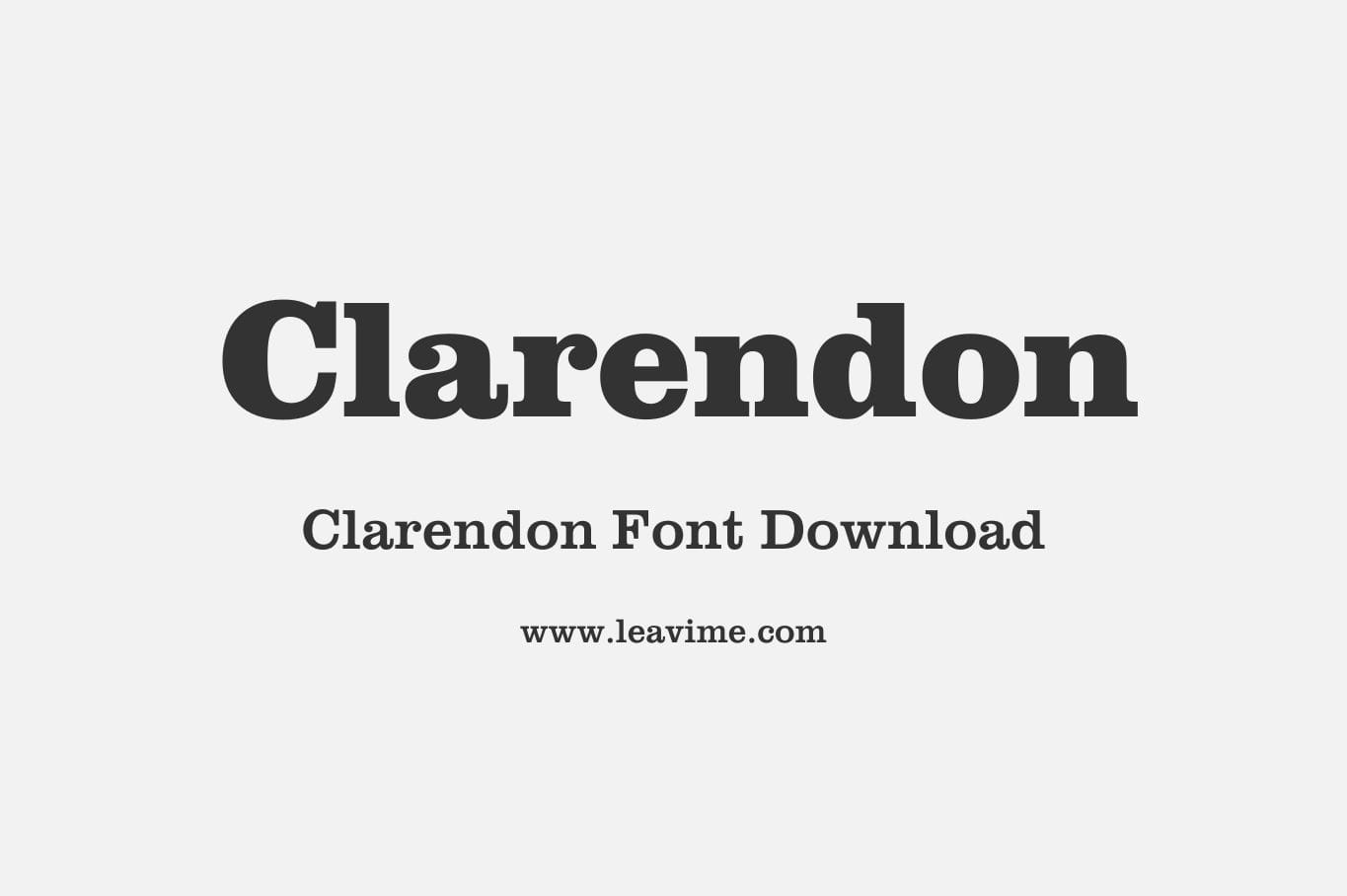
Clarendon Fonts: A Timeless Slab Serif Typeface
Clarendon fonts are among the most recognized and enduring slab serif typefaces in the world of typography. First introduced in 1845 by Thorogood and Co. (formerly known as Thorogood and Beasley) in London, this typeface quickly became a staple in both print and digital design. The design is believed to have been developed by Robert Besley and later refined by punchcutter Benjamin Fox, who played a crucial role in giving it its distinctive style.
Clarendon Font Family


The Unique Characteristics of Clarendon Typeface
Clarendon typeface stands out due to its bold, thick strokes and moderate contrast, making it highly legible for various applications. Unlike other serif fonts, Clarendon has a robust and structured appearance, making it ideal for headlines, posters, and advertising. It is characterized by:
- Strong and Thick Strokes – Clarendon fonts have solid lines that make them highly visible, even from a distance.
- Minimal Contrast – The balance between thick and thin strokes is subtle, which enhances readability.
- Rounded Edges – This feature adds warmth and a classic feel to the typeface.
- Versatility – It can be used for body text, branding, signage, and editorial design.
The Evolution and Popularity of Clarendon Fonts
Since its introduction, the Clarendon typeface has undergone multiple modifications, adapting to modern design needs while retaining its signature style. Over the years, various foundries have developed their own versions of Clarendon fonts, making them widely available for designers.
Clarendon became particularly popular in the 19th and 20th centuries for advertising, newspapers, and posters. Its ability to command attention without overwhelming the reader makes it a favorite among graphic designers, publishers, and branding experts. The font has been used in numerous famous designs, including the “WANTED” posters of the Wild West era and various corporate logos.
Where to Use Clarendon Fonts?
Clarendon fonts are incredibly versatile and can be applied to various design projects, such as:
- Editorial and Publishing – Ideal for headlines and subheadings in newspapers and magazines.
- Branding and Logos – Many brands use Clarendon for a strong, timeless identity.
- Posters and Advertising – The bold strokes ensure high visibility in marketing materials.
- Signage and Wayfinding – The high readability makes it suitable for directional and informational signage.
- Web Design – Modern web designers use Clarendon fonts to create a vintage and professional aesthetic.
Best Clarendon Font Variations
If you’re looking to incorporate Clarendon fonts into your design projects, here are some popular variations you might consider:
- Clarendon BT – A modern take with a refined, elegant appearance.
- Clarendon URW – A widely used version with excellent legibility.
- Belwe Bold – Inspired by Clarendon but with a stronger, decorative touch.
- Sentinel – A contemporary take on the Clarendon typeface, perfect for digital design.
Download Clarendon Fonts for Free
Many versions of the Clarendon font family are available for free or as licensed versions. Several font repositories offer downloadable versions, making it accessible to designers and typographers worldwide. To get the best quality.
Conclusion
The Clarendon typeface remains a timeless and versatile choice in typography. Whether used for editorial design, branding, or signage, its bold and structured aesthetic ensures clarity and impact. If you are looking for a strong yet classical font, Clarendon fonts are a fantastic option for any project.
DOWNLOADItem Type: Font, Software
Format: OTF, TTF
Total Files: 1