Verdana font or typeface verdana is a well-known humanist sans serif font designed by Matthew Carter for Microsoft Corporation in the mid-1990s. The final hand-tuning was carried out by Thomas Rickner at Monotype. The development of this typeface was initiated by Virginia Howlett, who recognized the need for a font that provided excellent readability on digital screens. Microsoft executive Steve Ballmer supported this project, and the name “Verdana” was derived from the word “verdant” (meaning green) and Ana, the name of Howlett’s daughter.
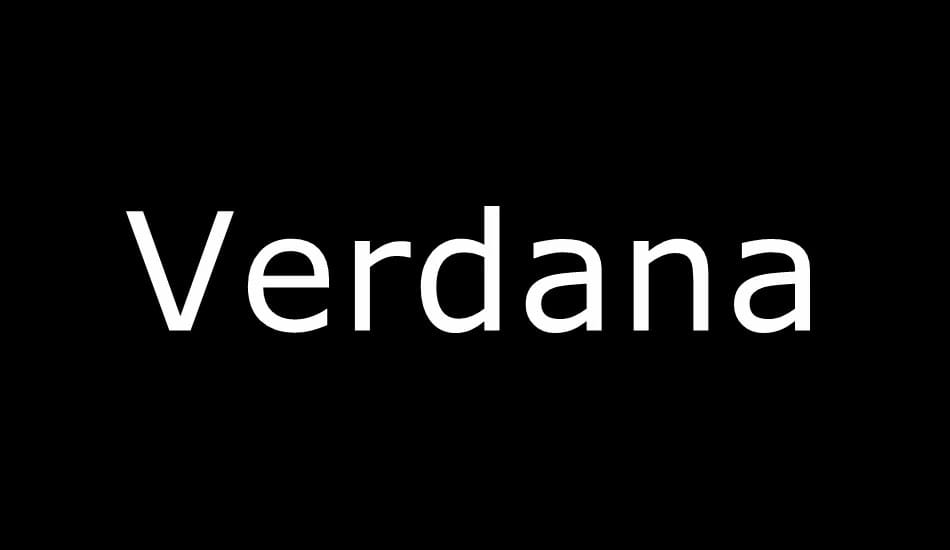
Verdana Font: A Versatile Sans Serif Typeface
Features and Design of Verdana Font
1. Humanist Sans Serif Typeface
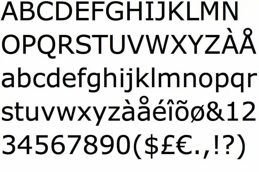
Verdana belongs to the humanist sans serif category, similar to Frutiger. It was specifically designed to be highly readable on low-resolution computer screens, making it an ideal choice for both digital and print content.
2. Large X-Height and Wide Proportions
One of the key characteristics of Verdana font is its large x-height, which refers to the tall lowercase letters. This ensures that text remains clear and easy to read, even at small font sizes. The letters are also designed with wide proportions to enhance legibility.
3. Distinct Letterforms for Better Readability
Verdana includes wide apertures and counters, meaning there is sufficient space between different letter strokes. This prevents confusion between similar-looking letters like ‘i’ and ‘l’ or ‘o’ and ‘0’. As a result, Verdana typeface is highly readable, making it an excellent choice for body text.
Usage and Popularity of Verdana Font
1. Digital and Web Design
The Verdana font was created primarily for computer screens, which is why it has become a default typeface for many websites, emails, and applications. The spacing and clarity make it one of the most commonly used fonts in web design.
2. Print and Corporate Branding
Although initially designed for screens, Verdana is also widely used in print media. Many companies choose this font for their corporate branding due to its modern and professional appearance. Its clean and simple style ensures that printed materials, such as brochures, reports, and advertisements, remain highly readable.
3. Accessibility and User-Friendly Typography
Since Verdana font was designed with readability in mind, it is an excellent choice for accessible design. Many organizations focused on inclusivity use this font to ensure their content can be easily read by people with visual impairments.
Comparing Verdana with Other Sans Serif Fonts
Verdana vs. Arial
- Verdana has a larger x-height than Arial, making it more readable at smaller sizes.
- The letter spacing in Verdana is wider, reducing visual crowding.
- Arial is more compact, while Verdana provides a more open and relaxed look.
Verdana vs. Helvetica
- Helvetica is often preferred for print design, while Verdana is optimized for digital screens.
- Verdana has wider characters, making it easier to distinguish letters compared to Helvetica’s tighter design.
Why Choose Verdana Font?
Verdana remains a top choice for digital and print typography due to its clarity, readability, and accessibility. Whether you are designing a website, corporate document, or user-friendly interface, this sans serif font ensures that your content is easy to read and visually appealing.
Download Verdana Font for Free
DOWNLOADLicense: Personal Use Only!
Font Type: Free
Format: TTF
Total Files: 1